
An honorable mention goes to the “MyCare” concept team for breaking the rules and extending the “Tech-timid” target group with disabled people – a target group worth paying special attention to with smart care concepts.
– design-people, December 2017
design-people is an ambitious Scandinavian innovation consultancy which collaborates with Develco Products which is a B2B company providing white label products within the field of smart homes.
The connection between the smart home devices and clouds happens through the internet. This provides the opportunity to monitor an extensive amount of different data and provide customers the best experience.
The demand was to create a smart home experience for a given target group. For this project the team was provided with different target groups and subjects, the one chosen was tech-timid as a target group in the health care sector.
Create a digital concept for a smart home which brings value for tech-timids by incorporating at least one of the Develco Products.
Theme: Health & Caretaking
Time span: 3 weeks
My role: UX designer.
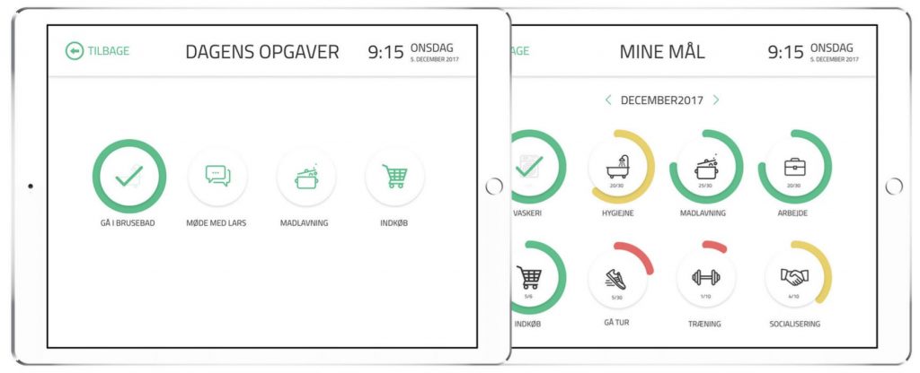
The team developed a solution for the tech-timid profile, specifically the mentally ill people in the field of Health Care. The solution is a smart home experience which will make life easier for the mentally ill person and his or her caregiver. It consists of a system where the admin is the caregiver, who can place daily tasks and monthly goals for their patient. These tasks and goals are shown on a display placed in the smart home.
Another useful feature is that the caregiver will monitor the data provided by the sensors and smart home components, placed in the home of the mentally ill. This is used to provide data about their hygiene habits and to provide data about the safety in the house. The mentally ill, on the other hand, will have a screen at home where he or she can check their daily tasks, get reminders by the caregiver and keep track of his or her goals etc.
All this will result in a more valuable conversation between the mentally ill and the caregiver.
Idea generation
Desk research
Interviews
Value proposition canvas
User scenarios
Internet of Things
Wireframing
High fidelity prototype
Think aloud test
Improve quality of life
Increase the feeling the independency
among the mentally ill person
Save time for the caregivers
design-people
Develco Products
Mentally ill people, who live alone,
are digital novices and help seekers
Caregivers

At the discovery phase of our project, I conducted two interviews in order to get a better understanding of the target audience and how they manage their everyday lives.
From the interviews I wished to get answers on the users behaviour and problems occuring throughout the day.
Moreover, I wanted to know what part the caregiver took in the persons life. Could the caregiver be a part of the solution?
Key takeaways
These takeaways were later on used to develop elements in the solution that cater these issues.

The core of the project was to implement IoT devices into the home of the mentally ill person to improve their quality of life.
The different smart home devices placed around the home collect data about the person, analyse these and send them to the caregiver. This data set gives the caregiver a better starting point for the conversation with his caretaker.
E.g. the data tells the caregiver if the home has been ventilated, if the person has been in the shower etc.
Moreover, the smart plugs register if the person has forgotten e.g. to turn off the stove. By light and a message on the display the person will be notified about the stove.
Smart home components used
Humidity sensor
Motion sensor
Smart bulbs
VOC sensor
Window sensor
Smart plugs for fridge and stove
Smoke detector

Example of installation of smart devices in the bathroom.
Before presenting the product to the client, I made two testing rounds in order to reveal possible usability problems.
First, I tested the wireframes to see if the navigation was intuitive, the icons were understandable, and the wording made sense.
The findings from the first think aloud test showed me that the navigation was instinctive, the wording was clear but not all the icons were understandable.
Moreover, the test showed an interesting result:
Problem: The progress bars changes colour depending on how far the user are with completing his goal. On the “Mine mål” page the test participant grouped the colours and thought the related goals should be completed together – instead of relating the coloured bar to the specific goal.
Solution: From this finding, I changed the progress bars from being straight and placed right below the goal to being circular, surrounding the goal and added a step indicator for each goal.
The tests were conducted on two people mentally ill persons who met the target audience.

Wireframe

Prototype

Home screen

Calendar with the tasks of the month

Today’s tasks
Progress of the goals for the current month

Question screen meeting the user three times a day so that his mood can be tracked.
Tip screen encouraging the user to take action based on the mood chosen.